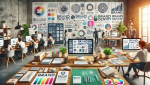
Introduction to Branding and Graphic Design
In today’s competitive digital marketplace, your business needs more than just a good product or service — it needs a memorable identity. That’s where branding and graphic design step in. A brand tells your story, and design gives it visual life. Whether you’re launching a new venture or rebranding an existing one, your visuals are the first impression — and often the most lasting.
Branding refers to the emotional and psychological relationship you establish with your audience, while graphic design is the visual vehicle that carries that message.
Together, they help:
- Establish trust
Trust is the foundation of any successful brand. Through consistent messaging, professional design, and transparent communication, you show your audience that your business is reliable and credible. Paid advertising plays a key role here by delivering polished, well-targeted content that reassures users they are engaging with a legitimate, high-quality brand. Ads that include customer testimonials, trust badges, reviews, or guarantees (like “100% money back” or “trusted by 10,000+ customers”) help build immediate trust with new users.
- Differentiate you from competitors
In competitive markets, branding helps you stand out. Whether it’s your visual identity, unique value proposition, tone of voice, or customer experience, strong branding makes your business instantly recognizable. Through paid ads, you can highlight what makes you different—like faster delivery, eco-friendly practices, award-winning support, or exclusive product features. When done right, your ads not only grab attention but also clearly communicate why a customer should choose you over someone else.
- Build recognition
Brand recognition means your audience can identify your brand just by seeing your logo, colors, or even tone of messaging. The more consistently your ads appear across platforms—using the same brand assets, voice, and visuals—the more likely users are to remember you. Paid advertising accelerates this recognition by putting your brand in front of your target audience repeatedly, ensuring you stay top-of-mind when they’re ready to buy.
- Create emotional connections
People often buy based on emotion, not logic. A strong brand tells a story that resonates with your audience’s values, aspirations, or lifestyle. Paid campaigns that evoke feelings—whether it’s happiness, confidence, nostalgia, or trust—create deeper, more meaningful connections. For example, an ad that shows how your product changes lives or supports a social cause can emotionally engage users and turn them into loyal customers. Emotional branding builds long-term relationships, not just one-time transactions.
Let’s explore how these powerful tools can elevate your business.
What Is Branding?
Branding is not just a logo — it’s the soul of your business. It’s what people think, feel, and say about your business when you’re not in the room.
Key elements of branding include:
- Brand Name: The unique name associated with your product or service.
Your brand name is the first impression people get of your business. It should be unique, memorable, and relevant to your product or service. A strong brand name not only makes you recognizable but also helps in building trust and credibility. Whether it’s creative (like “Apple”), descriptive (like “FixHackedSite”), or abstract (like “Google”), your brand name sets the tone for your entire identity and influences how people perceive you both online and offline.
- Brand Identity: Logo, color scheme, typography, and design system.
Brand identity includes all the visual elements that represent your brand, such as your logo, color palette, typography, icons, imagery, and design system. These elements create a cohesive look and feel across all platforms—your website, ads, social media, packaging, and more. A consistent brand identity helps customers instantly recognize your business and builds a professional image that increases brand loyalty and trust over time.
- Brand Voice: The tone and style of your messaging.
 Brand voice refers to the tone, language, and personality you use in your messaging. Whether your voice is formal, friendly, witty, or inspirational, it should be consistent across all communication—ads, website copy, emails, social media, etc. A clear brand voice helps your audience relate to your business on a human level and ensures that your messages feel genuine and aligned with your values.
- Brand Values: The beliefs and promises that guide your business.
Brand values are the core beliefs and promises that drive your business decisions. These could include integrity, innovation, sustainability, customer service, or community support. When shared effectively, brand values attract like-minded customers who support your mission. They differentiate you from competitors and give your business a deeper purpose beyond just selling products or services.
- Customer Experience: Every touchpoint your audience has with your business.
Customer experience covers every interaction a customer has with your brand—from seeing your ads and browsing your website to contacting support or receiving a product. A smooth, positive experience leads to customer satisfaction, loyalty, and repeat business. Investing in great customer experience means focusing on speed, convenience, clarity, and friendliness across all touchpoints. In paid advertising, making sure users land on fast, relevant, and engaging pages is a key part of delivering a seamless experience.
In essence, branding is your reputation. It’s how you present yourself to the world and how the world sees you.
The Role of Graphic Design in Branding
Graphic design translates your brand’s mission into visual communication. It’s the art of using design elements to build visual consistency and recognition.
Some key roles of graphic design in branding include:
- Designing a logo that reflects your brand’s values
Designing a logo that reflects your brand’s values is a foundational step in branding. Your logo acts as the face of your business and should visually communicate your mission, industry, and personality. It must be unique, memorable, and scalable across platforms—whether it’s on a website, a product label, or a social media profile.
- Establishing a consistent color palette
Establishing a consistent color palette helps create visual harmony across all your brand materials. Colors evoke emotions and can significantly influence how customers perceive your brand. For example, blue can convey trust and professionalism, while red might signal passion or urgency. A defined palette ensures your brand looks unified across every touchpoint.
- Selecting typography that aligns with your voice
Selecting typography that aligns with your voice enhances your brand’s readability and tone. Whether you’re aiming for a modern, playful, elegant, or corporate look, the fonts you choose help deliver that message. Consistent typography builds recognition and makes your content feel cohesive across different channels.
- Designing marketing collateral like business cards, brochures, and social posts
Designing marketing collateral like business cards, brochures, and social media posts ensures that your offline and online materials stay on-brand. These designs not only communicate information but also visually reinforce your brand identity. Thoughtfully designed collateral leaves a lasting impression and supports your marketing goals.
- Creating a visual style guide for brand consistency
Creating a visual style guide is essential for maintaining brand consistency as your business grows. This guide outlines how to use your logo, colors, fonts, imagery, and layout across all media. It helps internal teams, freelancers, and partners apply your brand assets correctly, ensuring a unified look and feel no matter where your brand appears.
Visual consistency builds trust. People trust what they recognize. That’s why design matters.
Logo Design: The Face of Your Brand
A logo is the centerpiece of your brand’s visual identity. A good logo is:
- Simple:
A simple logo is easy to recognize and understand at a glance. It avoids excessive details and clutter, allowing the viewer to instantly identify the brand. Simplicity ensures your logo is effective in a variety of settings—on screens, print, signage, or merchandise. Think of logos like Apple or Nike—clean, minimal, and iconic. A simple design improves scalability and readability without compromising on personality.
- Relevant:
Your logo should align with your industry, audience, and brand personality. A relevant logo uses symbols, shapes, or typography that reflect what your business does or the emotions it wants to convey. For example, a tech company might use sleek, futuristic fonts, while an organic food brand may opt for earthy colors and natural imagery. Relevance helps your audience connect with your brand and understand what you offer.
- Versatile:
A versatile logo works in multiple formats and sizes without losing impact. It should look great whether in full color or black and white, and whether it appears on a billboard or a business card. It must adapt well to various platforms—digital (websites, social media), print (flyers, packaging), and promotional items (mugs, t-shirts). Versatility also means your logo retains clarity and strength when resized, reversed, or placed on different backgrounds.
- Timeless:
A timeless logo avoids design trends that may quickly become outdated. Instead, it uses classic design principles that will still be effective years down the line. A timeless logo helps you build a long-lasting brand identity that doesn’t need frequent rebranding. It emphasizes quality, professionalism, and consistency—ensuring your brand stays recognizable even as your business evolves.
- Memorable:
A memorable logo leaves a strong impression after just one glance. This is achieved through a unique combination of design elements, such as a distinctive shape, clever symbolism, or striking typography. The goal is for people to recall your brand the next time they see the logo, helping drive recognition, trust, and customer loyalty. A memorable logo stands out in a crowded market and becomes synonymous with your product or service.
Your logo is your business’s handshake. It’s the first and most frequent interaction people have with your brand.
Color Psychology in Branding
Colors are more than aesthetics — they evoke emotions and influence decisions. Here’s what some popular brand colors convey:
- Blue: Trust, professionalism, calm (used by Facebook, PayPal, LinkedIn)
Blue symbolizes trust, reliability, professionalism, and calmness. It’s one of the most popular colors in branding because it creates a sense of security and stability. Brands like Facebook, PayPal, and LinkedIn use blue to reflect credibility and professionalism—especially important in tech and finance industries. It’s also a calming color that appeals to a broad audience, making it ideal for businesses that want to appear dependable and secure.
- Red: Excitement, urgency, passion (used by Coca-Cola, Netflix)
Red is associated with excitement, urgency, energy, and passion. It grabs attention quickly and stimulates emotions, which is why it’s often used in sales, entertainment, and food industries. Brands like Coca-Cola and Netflix use red to stir strong emotions and create a sense of urgency and boldness. Red can also increase heart rate and create a feeling of movement, which makes it effective for call-to-action buttons or limited-time offers.
- Green: Growth, health, nature (used by Whole Foods, Spotify)
Green conveys growth, health, sustainability, and nature. It’s commonly used by brands that focus on organic products, eco-friendliness, or wellness. Whole Foods and Spotify use green to symbolize freshness and balance. Green also represents wealth and financial prosperity, which is why some banks and investment platforms incorporate it. It gives off a calming, harmonious vibe, especially appealing in the health and environmental sectors.
- Yellow: Happiness, energy, optimism (used by McDonald’s, Snapchat)
Yellow represents happiness, energy, optimism, and warmth. It’s a cheerful, eye-catching color that evokes positivity and friendliness. Brands like McDonald’s and Snapchat use yellow to create a welcoming, upbeat impression. It can also signal affordability and fun, which is why it’s often used in branding for kids, food, or casual lifestyle products. However, too much yellow can be overwhelming, so it’s often paired with neutral tones for balance.
- Black/White: Luxury, elegance, sophistication (used by Chanel, Apple)
Black and white together communicate luxury, elegance, sophistication, and timelessness. These colors are clean, powerful, and versatile—often used in high-end branding to show class and minimalism. Chanel and Apple both use black and white to reflect modernity and quality. Black adds authority and formality, while white offers purity and simplicity. When used together, they create a sleek, premium feel that works well across all industries, especially in fashion, tech, and luxury goods.
Use color intentionally. Choose a palette that aligns with your brand’s personality and audience.
Typography: Voice in Visual Form
Typography is how your words appear — and it carries tone, personality, and clarity. Fonts should be:
- Readable: Easy to scan across devices
Readability is crucial in both digital and print branding. Typography must be clear and legible, whether it’s viewed on a smartphone, tablet, or desktop. Fonts should have well-defined letterforms and appropriate spacing to make reading effortless. Avoid overly decorative or thin fonts that strain the eyes, especially at smaller sizes. Good readability ensures your audience stays engaged with your content, no matter where they view it.
- Consistent: Used uniformly in all content
Consistency in typography helps build brand recognition and trust. Your chosen font (or set of fonts) should be used consistently across all touchpoints—website, social media, marketing materials, presentations, and printed collateral. This includes using the same font families, weights (bold, light, etc.), and sizes for headings, subheadings, and body text. Uniform typography keeps your brand looking professional and cohesive.
- Expressive: Reflective of your brand identity
Typography should express the personality and tone of your brand. A playful brand might choose a rounded, informal typeface, while a luxury brand might go for an elegant serif font. The font you select should communicate your brand’s mood, whether that’s bold, friendly, modern, traditional, or professional. This expressive element allows your audience to connect emotionally with your brand at a glance.
For example:
- Serif fonts (e.g., Times New Roman) convey tradition and professionalism.
Serif fonts have small lines or “feet” at the ends of each letter stroke. These fonts are often seen as classic, trustworthy, and formal. Because of their long history in print—especially in books, newspapers, and official documents—they evoke a sense of tradition and reliability. Brands in sectors like law, finance, education, or publishing often use serif fonts to convey authority and professionalism. Examples include Times New Roman, Georgia, and Garamond.
- Sans-serif fonts (e.g., Arial, Helvetica) feel modern and clean.
Sans-serif fonts, as the name suggests, do not have the decorative lines or strokes at the ends of letters. This gives them a sleek, minimal, and contemporary appearance. They are highly legible on screens and widely used in digital design, making them ideal for modern websites, tech companies, and startups. Sans-serif fonts reflect simplicity, clarity, and openness. Common examples include Arial, Helvetica, and Open Sans.
- Script fonts (e.g., Pacifico) feel elegant or creative.
Script fonts mimic handwritten or calligraphic styles, often featuring flowing, cursive letterforms. These fonts are used to express creativity, elegance, or sophistication, and are commonly seen in industries like fashion, beauty, weddings, or art. However, due to their intricate design, script fonts should be used sparingly and mainly for headings or logos. Popular examples include Pacifico, Brush Script, and Great Vibes.
Typography shapes perception. Choose fonts that reinforce your message.
Brand Identity Guidelines: Ensuring Consistency
A brand style guide ensures consistency across every platform. It’s the rulebook for how your brand appears visually and verbally.
Components of a style guide:
- Logo usage (sizing, spacing, color options)
This section outlines the correct and incorrect ways to display your logo. It includes minimum size requirements to ensure visibility, clear space rules to maintain visual impact, and approved color variations (e.g., full-color, black & white, reversed). It helps ensure your logo always looks clean, professional, and on-brand—whether it’s used on websites, business cards, or merchandise. Consistent usage protects brand integrity and avoids distortion or misuse.
- Color palette (with hex and RGB codes)
The color palette defines your primary and secondary brand colors, including exact HEX codes (for web) and RGB values (for digital design). This ensures your brand colors look the same across all media. The guide also explains how and when to use each color—e.g., background, text, buttons, or highlights. A well-defined color palette contributes to brand recognition and emotional consistency.
- Typography hierarchy (for headings, body, CTAs)
Typography hierarchy outlines which fonts to use for different types of content—such as H1 (main heading), H2 (subheadings), body text, captions, and CTAs (calls-to-action). It includes font sizes, weights (bold, regular), line spacing, and alignment. This ensures readability and visual flow, helping users quickly understand the importance of content elements on a page.
- Image and icon styles
This section defines the visual aesthetic of all imagery used in branding—from photography to illustrations to icons. Guidelines include image tone (e.g., natural, vibrant, moody), subject focus (e.g., people, products), and icon design (e.g., outline vs. solid, color rules). Maintaining a consistent style across visuals supports a cohesive brand experience across web, print, and social platforms.
- Voice and tone guidelines
Voice and tone rules describe how your brand “speaks” to its audience. The voice remains consistent (e.g., friendly, professional, witty), while tone can adapt based on context (e.g., more serious for an error message, more upbeat in marketing copy). This section includes examples of preferred language, phrasing, and terminology—and what to avoid. It ensures messaging feels human, relatable, and aligned with brand values.
This guide ensures that every designer, marketer, or developer maintains a unified look and feel.
Visual Branding Across Platforms
Your brand must be visually consistent on:
- Website: Layout, fonts, icons, CTAs
Your website is often the first impression of your brand. A consistent layout ensures users can navigate easily, and reinforces your visual identity. The fonts should match your brand’s chosen typefaces (as defined in your style guide), promoting a professional and cohesive look. Icons should follow a uniform style—whether minimalist, outlined, or colorful. CTAs (Calls-to-Action) like buttons or banners must be designed with brand colors and fonts, using action-driven language that reflects your brand voice (e.g., “Get Started,” “Book Now,” “Shop the Look”).
- Social Media: Posts, profile pics, highlight covers
Your social media presence should visually align with your overall branding. Profile pictures usually display your logo in a format that’s optimized for circles or squares. Posts (both images and captions) should reflect your brand colors, tone, and values. A consistent template style for posts—like using the same filter, border, or text overlay—improves recognition. Highlight covers on platforms like Instagram serve as mini-icons for your content categories, and should match your icon style and brand color palette.
- Email Marketing: Templates, headers, buttons
 Emails are a direct line to your audience and should mirror your brand’s visual identity. Templates should use your brand’s color palette, fonts, and layout structure. Headers in emails need to be on-brand with visual consistency—often combining your logo, tagline, or main message. Buttons (e.g., “Download Now,” “Claim Discount”) must be styled in line with your CTAs on the website, using the same fonts, colors, and tone for familiarity and trust.
- Print Materials: Brochures, flyers, posters
Even in the digital age, print materials are key in physical marketing campaigns. Whether it’s brochures, flyers, or posters, the use of brand colors, typography, and graphic elements ensures visual alignment with your digital platforms. Images should reflect your brand’s emotion and style (e.g., vibrant for a youth brand, minimal for a luxury service). These materials must also respect spacing, margins, and logo placement guidelines set in your brand guide.
- Packaging: If applicable, product labels or boxes
If you sell physical products, your packaging plays a major role in brand recognition. Whether it’s product labels, tags, boxes, or wrapping, the design should reflect your brand’s personality. Use your logo, brand colors, typography, and voice to communicate trust and professionalism. Packaging isn’t just functional—it’s an experience. Great packaging leaves a lasting impression, encourages unboxing shares on social media, and deepens emotional connections with your audience.
Each platform offers different challenges, but cohesion is key. A consistent visual identity enhances credibility.
Graphic Design Tools for Small Businesses
You don’t need to hire a full-time designer to create professional visuals. Here are tools that make design accessible:
🧰 Design Platforms:
- Canva – Easy drag-and-drop design for social and web
Canva is a user-friendly, browser-based design tool that’s ideal for beginners and professionals alike. It offers a drag-and-drop interface and thousands of pre-made templates for social media posts, infographics, presentations, business cards, and more. Canva’s brand kits allow you to store your logo, fonts, and colors for consistent branding. It’s perfect for quickly creating branded content without advanced design skills, and it supports both web and print-ready exports. Ideal for entrepreneurs, marketers, and small businesses who want to produce high-quality visuals efficiently.
- Adobe Express – Branded templates and motion graphics
Adobe Express (formerly Adobe Spark) combines the power of Adobe with simplified design workflows. It provides customizable templates for web pages, social media, and marketing materials. One standout feature is its support for lightweight motion graphics and animated elements, making your content more engaging. Adobe Express integrates well with other Adobe tools, offers AI-powered design suggestions, and is excellent for creating short videos, branded reels, and social story content. It’s designed for businesses that want Adobe-quality results without the learning curve of Photoshop or Illustrator.
- Figma – Great for UX/UI design collaboration
Figma is a powerful web-based tool tailored for UX/UI designers working on web or mobile interfaces. It allows for real-time collaboration, so teams can work together simultaneously on design projects—similar to Google Docs for design. It’s highly effective for wireframing, prototyping, and building design systems. Figma’s developer handoff features allow front-end developers to extract code snippets and measurements directly from the designs, improving workflow efficiency. It’s ideal for startups, product teams, and agencies working on digital platforms.
- Adobe Illustrator – Professional vector graphics
Adobe Illustrator is the industry-standard tool for creating vector-based artwork, which means your designs can scale infinitely without losing quality. It’s used by professional designers for creating logos, icons, illustrations, typography, and infographics. Illustrator gives you full control over shapes, lines, paths, and type, making it the go-to solution for precision and detail in graphic design. It integrates with Adobe Creative Cloud, allowing seamless collaboration with Photoshop, InDesign, and After Effects. Best suited for graphic designers, branding professionals, and illustrators who need full creative freedom.
🖼️ Stock Resources:
- Unsplash / Pexels – Free high-quality images
Unsplash and Pexels are renowned platforms that provide free, high-quality images suitable for a wide range of creative and commercial uses. These platforms feature a vast library of professionally shot photos covering diverse categories such as business, travel, technology, fashion, food, and more. The images are available in high resolution and can be downloaded without watermarks or the need for payment. They are ideal for use in website banners, blog posts, social media content, presentations, and advertising materials. While attribution is appreciated, it’s not required for most images, making them highly accessible for designers, marketers, and content creators seeking polished visuals.
- Flaticon / Noun Project – Icons for web and print
Flaticon and The Noun Project are leading resources for downloading icons used in both web and print designs. These platforms offer millions of vector icons in styles ranging from flat and outline to filled and colorful designs. Icons are available in scalable formats like SVG and PNG, allowing for flexibility in size and color customization. Designers use these icons in mobile apps, websites, presentations, infographics, packaging, and printed collateral. While free usage often requires attribution, premium subscriptions unlock additional features and usage rights. Both platforms help maintain visual consistency across branding materials by offering design-ready icons that align with various creative themes.
🎨 Color and Font Tools:
- Coolors – Build and test color schemes
Coolors is a user-friendly online tool designed to help you generate, customize, and test color schemes for branding and design projects. Whether you’re starting from scratch or need inspiration, Coolors allows you to create color palettes quickly by locking in your favorite colors and shuffling others until you find the perfect match. It also offers advanced tools like contrast checking (to ensure accessibility), color blindness simulation, and export options in various formats (HEX, RGB, CMYK). This makes it ideal for designers, developers, and marketers who want to maintain visual consistency across websites, logos, social media, and print materials.
- Google Fonts – Free and web-optimized fonts
Google Fonts is a free and reliable resource for web-optimized fonts that can be easily integrated into websites and design projects. With over 1,500 font families available, it offers a wide range of typographic styles including serif, sans-serif, handwriting, display, and monospace fonts. Google Fonts ensures fast loading, mobile-friendly performance, and full compatibility across modern browsers. You can browse fonts by popularity, style, weight, and language support. Designers and developers use Google Fonts to enhance the readability, aesthetic appeal, and branding of websites without licensing fees—making it a go-to choice for both beginners and professionals.
Using the right tools helps bring your brand vision to life — even without a full team.
Common Branding Mistakes to Avoid
Even great businesses fall into branding traps. Here are a few to steer clear of:
- Inconsistency: Different fonts, colors, or logos across platforms
When your brand appears differently on your website, social media, emails, or printed materials, it creates confusion and weakens brand recognition. Using inconsistent fonts, color palettes, or logo versions makes it harder for your audience to remember or trust your business. A strong brand maintains visual harmony across all platforms, reinforcing your identity and values with every interaction.
- Generic visuals: Stock logos or templates with no originality
Using overused templates or generic icons may seem cost-effective, but it dilutes your brand’s uniqueness. Generic visuals fail to communicate what sets your brand apart from competitors. A custom-designed logo or visual identity that reflects your brand story, values, and personality is far more memorable and impactful.
- Ignoring audience: Branding that appeals to you, not your customers
Branding should be created with your target audience in mind—not just your personal preferences. Choosing colors, messaging, or design styles that you like but don’t resonate with your audience can lead to disengagement. Effective branding is rooted in understanding your audience’s emotions, needs, and preferences to create stronger connections and loyalty.
- Neglecting mobile: Graphics and layouts that don’t scale
With most users accessing content via mobile devices, failing to optimize your branding elements (like logos, fonts, and visuals) for mobile can harm user experience. Text may be unreadable, images may not load properly, and layouts may break—leading to frustration and bounce rates. Responsive design ensures your brand looks polished on all screens.
- Lack of updates: Failing to refresh branding as the company evolves
As your business grows or pivots, your branding should reflect those changes. Outdated logos, slogans, or messaging can misrepresent your current offerings or values. Regularly reviewing and evolving your brand ensures it stays relevant, modern, and aligned with your goals and audience expectations.
Your brand should be strategic, not accidental. Avoid shortcuts and invest in originality.
Rebranding: When and How to Do It Right
Sometimes, a rebrand is necessary to reflect growth, attract new audiences, or shift market perception.
Reasons to rebrand:
- Business model or target market has changed
When a company shifts its products, services, or who it serves, the existing brand identity may no longer align with its new direction. For example, if a business that originally sold to small local retailers now targets enterprise clients, its visual identity, tone of voice, and messaging need to reflect that professional shift. A rebrand ensures the business communicates effectively with its new audience and accurately represents its evolved mission or offerings.
- Brand looks outdated
Design trends and customer expectations evolve. A logo, color palette, or website design that looked modern ten years ago might now appear old-fashioned or out of touch. If your branding feels stale or no longer visually competes in your industry, it may be time for a refresh. Updating your visuals, tone, and brand experience can signal to customers that your business is current, active, and in tune with modern tastes.
- Mergers or acquisitions
When two companies merge or one business acquires another, their identities, values, and audiences often need to be unified. A rebrand helps establish a new, cohesive identity that combines the strengths and reputations of both organizations. It ensures clarity for customers, investors, and employees, reducing confusion and laying the foundation for a stronger, aligned future brand.
- PR crisis or reputation damage
If a brand has faced negative publicity, customer trust may be damaged. In such cases, a rebrand can serve as a reset — a public signal that the company has acknowledged past issues, made changes, and is moving forward. This could involve changes in visual identity, brand messaging, or even core values. However, for a rebrand to be effective in this context, it must be backed by real improvements and transparency.
Steps to rebrand successfully:
- Audit your current brand and audience perceptions
Begin by analyzing how your current brand is perceived both internally (by employees) and externally (by customers, partners, and the public). This includes reviewing your logo, messaging, customer feedback, social media presence, and visual identity. Use surveys, reviews, and analytics tools to understand what’s working and what’s not. This step helps identify inconsistencies, weaknesses, and areas where the brand fails to connect with your target audience.
- Set new branding goals
Clearly define what you want to achieve with your rebrand. Are you trying to reach a new audience? Modernize your look? Distance your company from past issues? Expand globally? Your goals should align with your overall business strategy. These objectives will guide the visual, verbal, and experiential elements of your new brand and serve as benchmarks for success after launch.
- Design new visuals and messaging
Based on the audit and goals, begin developing your new brand identity. This can include a new logo, color scheme, typography, tagline, tone of voice, mission statement, and more. Your visuals and messaging should reflect your values, connect with your target audience, and differentiate your business from competitors. Ensure consistency across all platforms — from websites and social media to printed materials.
- Launch with a plan (internal and external)
Before announcing the rebrand to the public, introduce it internally to your team. Ensure all employees understand the reasons behind the change and how to represent the new brand. Then create an external launch plan, which might include press releases, social media campaigns, email announcements, and updated signage or packaging. A well-coordinated launch helps generate excitement and reinforces the brand’s evolution to customers.
- Update all digital and print assets
Consistency is critical after a rebrand. Update every customer touchpoint, including your website, social media profiles, email signatures, business cards, brochures, packaging, signage, and advertisements. Ensure the new visuals and messaging are applied uniformly across all channels. This avoids brand confusion and builds trust as your new identity becomes established.
Rebranding should be intentional, not reactive. Take the time to get it right.
The Future of Branding and Graphic Design
As trends evolve, so do branding strategies. Here are a few current and future directions:
- Minimalist logos with flat, clean lines
Modern brands are embracing simplicity. Minimalist logos avoid clutter and focus on bold, clean lines with flat design elements. These logos are versatile and scalable, making them ideal for digital platforms, mobile screens, and printed media. By stripping away unnecessary details, they communicate professionalism and confidence, often relying on clever use of negative space, geometry, or type-based marks.
- Motion graphics and animated brand assets
Static visuals are giving way to motion-based design. Brands are increasingly using animations in logos, intros, web banners, and social media posts. These motion graphics enhance engagement and can communicate complex ideas quickly. Whether it’s a subtle logo animation or dynamic explainer video, movement adds life to your brand and improves retention in a fast-scrolling digital environment.
- AI-generated content for scalable design
 Artificial Intelligence tools like DALL·E, Adobe Firefly, and Runway are being used to generate logos, illustrations, and visual templates. These tools allow designers to create high volumes of custom assets quickly, which is particularly useful for social media, e-commerce, or global campaigns. AI also enables personalization at scale — adapting visuals to user data or behavior for targeted branding experiences.
- Inclusive design that reflects diverse audiences
Today’s consumers expect brands to represent and respect diversity. Inclusive design incorporates imagery, language, and visuals that reflect different cultures, identities, abilities, ages, and lifestyles. This includes everything from using gender-neutral icons to showing people of all backgrounds in marketing materials. Inclusive branding builds trust and helps businesses connect more authentically with wider audiences.
- Sustainable branding tied to eco-conscious values
Eco-awareness is not just a social movement — it’s becoming a design priority. Brands are integrating sustainability into their visual identities by using earthy color palettes, recycled materials, and messaging that promotes environmental responsibility. Logos may incorporate nature-inspired elements, and packaging often highlights reusability or biodegradability. This trend appeals to eco-conscious consumers and positions brands as socially responsible.
The future is flexible, digital-first, and hyper-personalized. Your brand must evolve to stay relevant — without losing its core identity.
Conclusion: Design a Brand That Connects and Converts
Branding and graphic design are not optional — they’re foundational. A cohesive, thoughtful, and emotionally resonant brand sets you apart in a crowded marketplace. It builds trust, communicates value, and creates loyal fans.
Whether you’re just starting or refreshing your brand, invest in the power of visuals.
Appledew UK can help you build a brand that not only looks great — but converts.
AI Implementation Prompt:
You are an expert in branding, graphic design, and digital marketing. Using the strategies in the blog post “Branding and Graphic Design”, create a detailed, actionable plan for a small business that includes:
- Defining and refining brand identity (name, logo, color palette, typography, voice, and core values).
- Creating a brand style guide for consistency across website, social media, email, print, and packaging.
- Developing visual branding for each platform, including graphics, templates, icons, buttons, and collateral.
- Suggesting AI design tools (Canva, Adobe Express, Figma, Illustrator, DALL·E, Runway) and explaining efficient usage.
- Avoiding common branding mistakes like inconsistency, generic visuals, ignoring mobile, or outdated branding.
- Planning a rebrand if necessary (audit, goals, new visuals and messaging, internal/external launch, asset updates).
- Forward-looking strategies: minimalist logos, motion graphics, AI-generated content, inclusive and sustainable design.
- Ensuring the output aligns with Google Search Quality Guidelines (E-E-A-T), focusing on clarity, actionable advice, and user benefit.
Include clear, structured steps with examples that a small business can implement. Review the AI output against your brand values and audience before applying. For personalized help, reach out to [https://appledew.co.uk/contact-us/].