
In today’s digital-first world, your website is your brand’s most powerful tool. Whether you’re a startup, an e-commerce business, or a service provider, an exceptional website isn’t optional—it’s essential. At Appledew UK, we specialize in website design and development that fuses creativity with performance.
This in-depth guide explores the entire process of website design and development, from concept to launch, and beyond.
Understanding Website Design vs. Website Development
Many confuse design with development, but they serve different (yet complementary) purposes:
- Website Design focuses on aesthetics and usability (UI/UX).
 Website design centers on the visual aesthetics and user experience of a site. It involves creating an appealing and intuitive layout that ensures visitors can navigate the site easily and enjoyably. This includes elements like color schemes, typography, imagery, and overall visual hierarchy, all tailored to enhance user interface (UI) and user experience (UX). The goal is to make the site not only look good but also feel intuitive and accessible across all devices.
- Website Development handles the coding, functionality, and technical aspects.
In contrast, website development is focused on bringing the design to life through coding and technical implementation. It handles the structure, interactivity, and functionality behind the scenes, using languages such as HTML, CSS, JavaScript, and often backend technologies like PHP, Python, or databases. Development ensures that the website operates smoothly, loads efficiently, is secure, and performs all intended functions—such as form submissions, animations, or e-commerce transactions—reliably. Together, design and development create a complete, functional, and engaging website.
Together, they ensure your site is beautiful, intuitive, and functional.
At Appledew UK, we treat design and development as two sides of the same powerful coin.
Why Your Business Needs a Professional Website
A professional website helps you:
- Establish credibility
A well-crafted website plays a crucial role in several key areas of business success. First, it helps establish credibility. In today’s digital-first world, consumers often judge a company’s professionalism and legitimacy based on its online presence. A clean, modern, and informative website signals that the business is trustworthy and up-to-date.
- Build brand identity
Second, a website is essential for building brand identity. It reflects the company’s personality, values, and messaging through design, tone, and content. Consistent branding across the site—including logos, color schemes, and voice—helps create a memorable and recognizable presence that distinguishes the business from competitors.
- Convert visitors into customers
Third, a well-optimized website is a powerful tool for converting visitors into customers. Strategic design elements like clear calls to action (CTAs), user-friendly navigation, fast load times, and compelling content guide users through the customer journey—from interest to engagement to purchase or inquiry.
- Support SEO and online marketing
Additionally, a website supports SEO and online marketing efforts. By incorporating relevant keywords, meta tags, quality content, and mobile optimization, a site becomes more visible in search engine results. This drives organic traffic and enhances the effectiveness of digital marketing campaigns, including email, social media, and pay-per-click advertising.
- Provide information 24/7
Lastly, a website provides information 24/7. Unlike physical storefronts or office hours, a website is always accessible, allowing customers to learn about products, services, pricing, or contact details at any time. This constant availability improves customer service and supports global accessibility, expanding reach and engagement across different time zones.
In a world where first impressions are digital, investing in professional web design is a non-negotiable.
The Website Design and Development Process
Our typical workflow at Appledew UK includes:
- Discovery & Strategy
Discovery & Strategy is the foundational step where goals, target audience, market positioning, and business objectives are identified. During this phase, research is conducted to understand the competitive landscape, user needs, and functional requirements. This strategic planning helps ensure that every aspect of the website aligns with the company’s mission and digital goals.
- Wireframing & Mockups
Wireframing & Mockups come next, providing a visual blueprint of the website’s structure and layout before any actual design work begins. Wireframes are low-fidelity representations that map out user flow, navigation, and content placement. Mockups follow with more detailed, high-fidelity designs showing colors, fonts, and visual elements. This stage is crucial for aligning design expectations and planning user experience (UX).
- Design & Branding
Design & Branding involves creating the visual identity of the website. This includes choosing color schemes, typography, imagery, and other UI (user interface) elements that reflect the brand’s personality and appeal to the target audience. Good design is not only attractive but also functional, helping guide users smoothly through the site.
- Frontend & Backend Development
Frontend & Backend Development is where the site is actually built. Frontend development handles the parts of the site users interact with—layouts, animations, responsiveness—using technologies like HTML, CSS, and JavaScript. Backend development manages the server, databases, APIs, and other systems behind the scenes that ensure the site functions correctly, such as user logins, form submissions, or e-commerce transactions.
- Quality Testing
Quality Testing is conducted to ensure that the website is bug-free, responsive, secure, and performs well across different browsers and devices. This includes testing site speed, links, forms, integrations, and compatibility. Accessibility and user experience are also evaluated to ensure a smooth and inclusive experience.
- Launch
Launch is the deployment of the website to a live server, making it publicly accessible. Before launch, final checks are made to ensure everything functions as intended. A smooth launch requires careful coordination between developers, designers, and content managers to ensure a seamless transition.
- Maintenance & Optimization
Maintenance & Optimization is an ongoing phase that keeps the website updated, secure, and performing well. This includes fixing bugs, updating content, improving load times, enhancing SEO, monitoring traffic, and implementing upgrades based on user feedback or analytics. Continuous optimization ensures the website remains relevant and competitive over time.
Each phase is collaborative, transparent, and tailored to your business needs.
Choosing Between Custom and Template-Based Design
Here’s how to decide between custom and template-based designs:
Custom Design
- 100% unique
100% unique means that the website is built from the ground up specifically for your business. Every design element, feature, and layout is created to reflect your brand’s personality and goals. Unlike template-based sites, there are no limitations or shared designs with other businesses. This uniqueness helps your site stand out in a crowded digital space and delivers a more memorable user experience.
- Tailored to your brand
Tailored to your brand refers to how custom websites are designed with your specific branding, tone, and messaging in mind. Everything—from colors, typography, and imagery to the layout and user interface—is crafted to align with your brand identity. This ensures consistency across all your marketing channels and reinforces your brand in the minds of your visitors and customers.
- More scalable and flexible
More scalable and flexible means that a custom website can grow and evolve with your business. Whether you need to add new features, integrate third-party tools, handle higher traffic, or expand into new services, a custom-built site offers the technical foundation and flexibility to accommodate these changes without major overhauls. It’s built with scalability in mind, which is especially important for businesses planning long-term growth.
- Higher upfront cost
Higher upfront cost reflects the increased investment needed for a custom website. Because it involves more in-depth planning, unique design, and tailored development, it typically requires more time and specialized expertise than using a pre-made template. While the initial cost is higher, it often pays off in the long run through better performance, brand consistency, and reduced limitations as your needs evolve.
Template-Based Design
- Faster turnaround
Faster turnaround means that template-based websites can be launched much more quickly than custom-built sites. Since the core design and structure are already created, you only need to replace the placeholder content with your own text, images, and branding. This is ideal for businesses or individuals who need to go live fast, such as for a product launch, event, or startup MVP.
- Cost-effective
Cost-effective refers to the significantly lower cost of using pre-designed templates. You don’t need to hire a full design and development team; in many cases, you can build the site yourself or hire someone for a small fee. This makes templates appealing to small businesses, freelancers, and startups working with tight budgets.
- Limited customization
Limited customization highlights one of the main trade-offs. While many templates offer some flexibility, you’re still confined to the structure and design choices built into the template. Making significant changes—like altering layouts, adding custom features, or integrating advanced functionality—can be difficult, time-consuming, or even impossible without custom development.
- May look like other sites
May look like other sites points to the risk of lack of originality. Because templates are sold or downloaded by many users, your site may end up looking similar to others using the same template—possibly even competitors. This can hurt brand differentiation and make your business appear less professional or unique, especially in competitive industries where standing out is crucial.
Appledew UK offers both options depending on your goals, timeline, and budget.
Importance of Mobile-First and Responsive Design
With over 60% of traffic coming from mobile, mobile responsiveness is critical.
- Google ranks mobile-friendly sites higher.
Google ranks mobile-friendly sites higher refers to how search engines, especially Google, prioritize websites that are optimized for mobile devices. Since the majority of web traffic now comes from smartphones and tablets, Google uses mobile-first indexing, meaning it primarily evaluates the mobile version of a site to determine its search ranking. If your site is not mobile-friendly—such as having small text, difficult navigation, or slow load times on mobile devices—it’s likely to rank lower in search results, leading to reduced visibility and traffic.
- Users bounce if the mobile experience is poor.
Users bounce if the mobile experience is poor explains how critical user experience is on mobile. A site that loads slowly, displays incorrectly, or is hard to navigate on a phone will frustrate users, causing them to leave immediately—this is known as a “bounce.” High bounce rates can negatively impact your site’s credibility, reduce conversion opportunities, and signal to search engines that your site isn’t providing value, which may further hurt your SEO ranking.
- Responsive designs adapt to all screen sizes—phones, tablets, desktops.
Responsive designs adapt to all screen sizes—phones, tablets, desktops means that the website layout automatically adjusts to provide an optimal viewing experience across all devices. A responsive design uses flexible grids, images, and CSS media queries to ensure the content looks good and functions properly no matter the screen size or orientation. This not only improves usability but also ensures that all users, regardless of their device, receive a consistent and polished experience—which increases engagement, satisfaction, and conversions.
We build mobile-first, always ensuring responsive design is integrated from the start.
Essential Website Features for Modern Businesses
Every effective website needs to have:
- Fast-loading pages
Fast-loading pages are essential for both user experience and SEO. Visitors expect websites to load in under three seconds—anything slower can lead to frustration and increased bounce rates. Search engines like Google also consider page speed as a ranking factor. Speed optimization involves techniques such as minifying code, enabling browser caching, and using a reliable hosting provider.
- Clear CTAs (Calls-to-Action)
Clear CTAs (Calls-to-Action) guide visitors toward the desired next steps, such as signing up for a newsletter, booking a consultation, or making a purchase. Effective CTAs are prominently placed, visually distinct, and use action-driven language. They play a critical role in driving conversions and helping users navigate the site with purpose.
- SEO-friendly structure
 SEO-friendly structure means that the website is organized in a way that makes it easy for search engines to crawl and index its content. This includes using clean URLs, proper heading tags (H1, H2, etc.), relevant keywords, meta descriptions, and a logical content hierarchy. An optimized structure improves search visibility and ensures your content reaches the right audience.
- Easy navigation
Easy navigation ensures users can find what they’re looking for without frustration. A well-structured menu, intuitive layout, and logical page hierarchy make for a seamless user experience. Good navigation reduces bounce rates and increases the time users spend on your site, which can lead to higher engagement and conversions.
- Contact and lead forms
Contact and lead forms are crucial for capturing visitor information and turning interest into actionable leads. These forms should be simple, easy to fill out, and strategically placed throughout the site—often on the homepage, contact page, or landing pages. Features like auto-fill, validation, and mobile optimization further enhance usability.
- Secure HTTPS protocol
Secure HTTPS protocol protects both your website and its users. HTTPS encrypts the data exchanged between the browser and the server, ensuring secure communication. It’s a basic requirement for any modern website, especially those handling sensitive information (e.g., passwords, credit cards), and it’s also a ranking factor in Google’s algorithm.
- Optimised images and assets
Optimised images and assets contribute to faster load times and a better user experience. This involves compressing images without sacrificing quality, using appropriate file formats, implementing lazy loading, and reducing the size of scripts and stylesheets. Proper asset optimization ensures your website is visually rich without compromising performance.
These features aren’t luxury—they’re the foundation of performance and trust.
CMS Options: WordPress, Shopify, Webflow, and More
Choosing the right CMS (Content Management System) is crucial. Here are top options:
- WordPress – Flexible, great for blogs and small business sites
WordPress is the world’s most widely used content management system (CMS), known for its flexibility and ease of use. It’s especially popular among bloggers, small businesses, and service providers. With thousands of themes and plugins available, WordPress allows users to build feature-rich websites without advanced coding skills. It’s open-source, highly customizable, and ideal for content-heavy websites like blogs, portfolios, and company sites. However, performance and security depend heavily on proper maintenance and quality hosting.
- Shopify – Ideal for e-commerce
Shopify is a dedicated e-commerce platform designed specifically for online stores. It offers everything needed to set up, manage, and grow an online retail business—from inventory management and payment processing to marketing tools and shipping integrations. Shopify is user-friendly, secure, and scalable, making it a strong choice for entrepreneurs and small to medium-sized businesses focused primarily on selling products online. Its app store and built-in features support powerful functionality with minimal technical overhead.
- Webflow – Visually powerful and clean
Webflow is a design-first platform that combines the visual freedom of a website builder with the power of custom front-end code. It’s especially popular among designers and agencies for its clean, responsive design capabilities and visual development tools. Webflow lets users build high-quality websites without writing traditional code, while still outputting production-ready HTML, CSS, and JavaScript. It’s ideal for marketing sites, creative portfolios, and small business websites that require strong visual design and animation.
- Magento – Suitable for large-scale online stores
Magento (now Adobe Commerce) is a robust, enterprise-level e-commerce platform designed for large businesses with complex product catalogs and custom functionality needs. It supports powerful integrations, multi-language and multi-currency capabilities, and advanced customization through its modular architecture. Magento is highly scalable and suited for businesses that need a fully tailored and feature-rich e-commerce solution. However, it typically requires a development team and strong technical infrastructure to manage effectively.
- Custom-coded – Fully tailored and performance-focused
Custom-coded websites are built from the ground up using programming languages like HTML, CSS, JavaScript, PHP, or Python. This approach offers complete control over design, performance, and functionality. It’s ideal for businesses with unique requirements, high traffic expectations, or complex workflows that off-the-shelf platforms can’t support. While custom coding offers unmatched flexibility and optimization potential, it also comes with a higher upfront cost, longer development time, and the need for ongoing technical maintenance.
Appledew UK helps you select and implement the CMS that best fits your business model.
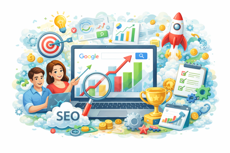
SEO and Site Performance: Design with Search in Mind
A good-looking site is useless if it’s not found. SEO should be baked into design:
- Clean URL structures
Clean URLs are short, readable, and keyword-rich links that clearly indicate the page’s content. For example, www.example.com/services/web-design is far more SEO-friendly than www.example.com/page?id=12345. Clean URLs are easier for both users and search engines to understand, which improves crawlability, click-through rates, and overall site organization.
- Fast loading times
Page speed is a key ranking factor in search engine algorithms. Websites that load quickly provide a better user experience, reduce bounce rates, and encourage visitors to stay longer. Techniques like image compression, browser caching, minifying code, using content delivery networks (CDNs), and choosing quality hosting all contribute to faster load times, which positively impact SEO and user satisfaction.
- Mobile usability
With the majority of web traffic coming from mobile devices, Google prioritizes mobile-friendly websites through its mobile-first indexing. A site with mobile usability adapts to different screen sizes, offers intuitive touch navigation, and maintains fast performance on smartphones and tablets. Poor mobile usability can lead to higher bounce rates and lower search rankings, while a responsive, mobile-optimized design boosts engagement and SEO.
- Meta tags and descriptions
Meta tags—including meta titles and meta descriptions—play a critical role in on-page SEO. The meta title appears as the clickable headline in search results, while the meta description provides a brief summary of the page’s content. Well-crafted meta tags using relevant keywords can improve click-through rates and help search engines better understand the page’s relevance to search queries.
- Schema markup
Schema markup is a form of structured data that helps search engines interpret the content on a page more effectively. By tagging content elements like reviews, products, events, or FAQs with schema, you can enhance search listings with rich snippets—such as star ratings, pricing, or breadcrumbs. This increases visibility in search results and can lead to higher click-through rates.
- Accessibility standards
Accessibility ensures your website is usable by everyone, including people with disabilities. Following standards such as the Web Content Accessibility Guidelines (WCAG) not only broadens your audience but also supports SEO. Features like alt text for images, proper heading structure, keyboard navigation, and readable fonts help both users and search engines navigate and understand your content more effectively.
We don’t just design; we optimise for search engines and humans.
Speed Optimisation and Technical Best Practices
Page speed affects everything—SEO, UX, and bounce rates. To maximise speed, we:
- Compress images and assets
Large image and media files are one of the most common causes of slow-loading websites. Compressing these files reduces their size without noticeably compromising quality. Tools like TinyPNG, ImageOptim, or built-in CMS plugins can automate image optimization. Similarly, other assets like fonts, videos, and downloadable files should also be compressed to reduce bandwidth usage and load times.
- Use lazy loading
Lazy loading is a performance technique that delays the loading of images, videos, or other media until they are about to appear in the user’s viewport (on-screen). Instead of loading all content at once when a page loads, lazy loading prioritizes only the visible parts first. This improves initial load times and reduces the strain on both server and browser resources—especially on image-heavy pages.
- Minify CSS, HTML, and JavaScript
Minification involves removing unnecessary characters—like spaces, comments, and line breaks—from code files. Minified code runs faster and requires less bandwidth, leading to quicker page rendering. Tools like UglifyJS, CSSNano, or built-in functionality in web frameworks or CMS plugins can automate this process, helping streamline your website’s performance without altering functionality.
- Integrate caching mechanisms
Caching stores frequently accessed data temporarily so it can be quickly retrieved without needing to reload everything from scratch. Browser caching, server-side caching, and object caching are common methods. With caching in place, returning visitors experience faster load times and reduced server load, which improves site reliability and user satisfaction.
- Use CDN (Content Delivery Network)
A CDN is a network of distributed servers that deliver website content from the nearest location to the user. By serving images, scripts, and other static assets from these edge servers, CDNs reduce latency and improve load speeds—especially for users in different geographic regions. Popular CDN providers include Cloudflare, Amazon CloudFront, and Akamai.
- Avoid bloated plugins or themes
Overusing plugins or using poorly coded, bloated themes can significantly slow down your website. These add-ons can load unnecessary scripts, styles, or features that aren’t needed for your site. It’s best to use only essential, well-maintained plugins and opt for lightweight, performance-optimized themes. Regularly auditing and removing unused plugins can further streamline performance and reduce security risks.
Appledew UK ensures your website loads fast—everywhere, every time.
E-commerce Website Design and Development
If you’re selling online, you need a website that’s:
- Secure
Security is non-negotiable for any e-commerce site. It must protect customer data, such as personal details and payment information, through HTTPS encryption and secure socket layer (SSL) certificates. Additionally, features like two-factor authentication, secure payment processing, regular software updates, and compliance with data protection regulations (like GDPR or PCI-DSS) are critical. A secure website builds customer trust and protects both your business and users from fraud or cyberattacks.
- Fast
Speed is crucial for retaining visitors and maximizing conversions. E-commerce websites often handle large product catalogs, images, and dynamic content, all of which can slow down performance. Optimizing images, implementing caching, using content delivery networks (CDNs), and minimizing code help ensure fast page loading. A faster site enhances user experience, reduces bounce rates, and improves SEO rankings—especially important in competitive online retail environments.
- Easy to navigate
Clear and intuitive navigation helps users find what they’re looking for quickly, which directly affects sales. This includes features like a well-structured menu, filters (by size, price, brand, etc.), breadcrumbs, and an effective search bar. A streamlined checkout process, accessible product categories, and logical site architecture ensure a smooth user journey, from browsing to purchasing.
- Conversion-optimised
An e-commerce website should be strategically designed to turn visitors into customers. Conversion optimization involves the placement of clear and compelling calls-to-action (CTAs), simplified checkout flows, trust indicators (like reviews or guarantees), product recommendations, and mobile-friendly design. It also includes A/B testing and analytics to understand user behavior and improve performance based on data.
- Integrated with payment gateways, inventory tools, CRM
A fully functional e-commerce site integrates with key business systems to automate and streamline operations. Payment gateway integrations (like Stripe, PayPal, or Square) allow for secure and flexible payment options. Inventory management tools help track stock levels, avoid overselling, and streamline order fulfillment. CRM (Customer Relationship Management) systems, such as HubSpot or Salesforce, allow businesses to manage customer data, track behavior, and personalize marketing efforts. These integrations enhance efficiency, reduce manual work, and improve the overall customer experience.
We specialise in e-commerce platforms like Shopify, WooCommerce, and Magento, tailoring your store to your target audience.
A stunning storefront combined with technical robustness = higher conversions.
Post-Launch Support and Ongoing Development
Launching your website is just the beginning.
Our post-launch support includes:
- Security updates
Regular security updates are crucial to protect a website from vulnerabilities, malware, and hacking attempts. This includes updating the core CMS (like WordPress), plugins, themes, server software, and security certificates (SSL). Keeping all components current helps patch known security flaws and ensures compliance with data protection standards. Without consistent updates, websites become easy targets for cyber threats, putting both business and user data at risk.
- Performance monitoring
Monitoring performance involves continuously tracking website speed, uptime, and responsiveness. Tools like Google PageSpeed Insights, GTmetrix, or real-time monitoring platforms can detect slow-loading pages, broken elements, or server issues. By identifying and resolving performance bottlenecks, you ensure a smooth and reliable experience for users, which also contributes to improved SEO and customer satisfaction.
- Content updates
 Regularly updating content keeps your website relevant and engaging for both users and search engines. This can include adding blog posts, updating product or service information, publishing customer testimonials, or refreshing images and multimedia. Fresh content boosts SEO rankings, increases return visits, and reflects the business’s growth, seasonal changes, or evolving offerings.
- New feature development
As your business grows or customer needs change, your website should evolve to accommodate new functionality. This may involve developing new features such as online booking systems, customer portals, chatbots, integrations with third-party tools, or e-commerce enhancements. Proactive development keeps your website competitive and aligned with your strategic goals.
- Bug fixes
No website is perfect—bugs and glitches are inevitable over time. These might include broken links, layout issues, form errors, or compatibility problems with different browsers or devices. Promptly identifying and fixing bugs ensures a smooth user experience, maintains trust, and prevents minor issues from escalating into major problems.
We offer monthly maintenance plans to keep your site healthy, fast, and secure.
Don’t just launch. Grow with us.
Why Choose Appledew UK for Website Design & Development
When you partner with Appledew UK, you benefit from:
🎯 Client-first philosophy
💻 In-house designers & developers
🚀 SEO-ready builds
🔒 Security-focused architecture
📱 Mobile-first & responsive design
🛠 Post-launch support & maintenance
💬 Transparent communication
We don’t just deliver websites. We deliver digital experiences that grow your brand.
Conclusion: Your Website Is Your Business’s Digital Home
Your website isn’t just a page on the internet—it’s a platform for growth, storytelling, and customer engagement. With Appledew UK, you get more than just a service; you get a strategic partner dedicated to your digital success.
📞 Ready to design or redesign your website? Let’s talk.