There are many ways to assess your website’s accessibility, including various online accessibility checkers and evaluation tools. You can use one of these applications to check if there are any broken links on your website.
It’s helpful to manually test the site for accessibility by having different people from different backgrounds navigate the site and report their findings to you. It is not the best way to test a website for accessibility. However, it is helpful to see how the site appears to different people with different needs.
Do You Know Your Website’s Hidden Growth Potential?
Take our conversion-focused web design test to see how much of your site is designed for growth and what parts make people leave your page forever.
Finding and Fixing Issues:
1. Color Contrast
Color contrast refers to the choice of colors used on a website to balance the contrast ratio. If you’re using white text on a light grey background, it’s evident that deciphering it won’t be easy for anyone, even if they have perfect vision.
But getting the correct color contrast isn’t as simple as using brightly clashing hues. For example, using purple writing on an orange background will allow a reader to distinguish letters from the background but can be disastrous for those with dyslexia or color blindness.
Since studies show that approximately one out of every twelve men and one out of every two hundred women suffer from color blindness (color vision deficiency), your website’s color scheme is crucial for accessibility. If you ignore this, you may exclude a large segment of potential users if you don’t factor their needs into your designs.
There are different types of color blindness, but one of the most common involves an inability to distinguish between red and green. If you’re using images with data, these two colors are often used for graphs, headers, or map elements, so they’re essential considerations.
To make your website as accessible as possible, not just to those who are color blind, do the following:
- Use dots, stripes, or checks on top of colors in graphs and charts. It helps the different areas to stand out, even if the colors do not.
- Avoid color combinations where colors are too close on the spectrum, e.g., green and blue, blue and purple, and gray and black. If a person is visually impaired, they won’t differentiate between them.
- If you have an eCommerce site, add text labels to products that specify the color. It ensures that users can select the product they want without relying solely on an image.
2. Alt Text On Images
Alt-text is important because it describes images for people who can’t see them. For example, if someone has a vision problem, they may be able to use their screen reader to read out loud the alt text of an image. The description should be brief and precise, with the essential elements stated first.
Alt text must be plain and avoid repeating information stated in the following paragraphs.
You must create brief descriptions that adequately explain the image.
For example, poorly written alt text would be “man pointing at the screen.”

A good description adds value by providing additional information that helps people understand the image.
Also, don’t start alt text with “an image of…” or “a picture of…”. Rather, dive straight into the description. Keep the text short. Around 125 characters are the ideal word count.
When you check your website for accessibility, hover over all images to ensure the alt text formats are correct.
3. Ambiguous Links
Links to connect text to another place helps create a more three-dimensional web page. Users can navigate “into” the text, not just up and down.
To make these hyperlinks user-friendly, you need to look at their accessibility for those using screen readers (for the visually impaired), color-blind users, or people with minimal IT skills (who may not be able to use a mouse). It’s advised to embed links within the text.
You can use this technique to create links within your content by highlighting the words you want to link and inserting the link. The selected words should be descriptive enough to help people understand what the page is about.

Links with “click here” and “read more” are not accurate descriptors and are often best avoided. A user who relies on a screen reader will read only those words and not be able to tell what value the link adds or why he needs to click on it. In contrast, if the link has a small descriptor such as “enroll in the program,” it immediately communicates the what and why of the link, rather than just being a vague call to action.
When creating content and linking, consider the experience of different users with varying abilities and devices and tailor the linking strategy to be broad so that it works across these platforms.
4. Missing Link Text
Following link text protocols ensures that websites are accessible for people who use assistive technologies.
Web Content Accessibility Guidelines require that there is a context for each link. But it’s also essential to ensure that people using screen readers can navigate between hyperlinks without going through all the connecting paragraphs. Some guidelines are:
- Do not use “link” as part of a link text

- Don’t capitalize links. Screen reading software can read upper case text one letter at a time
- Don’t use URLs as link text
- Don’t put in too many links
Regularly check your site to ensure no missing or broken links, especially if you have linked to external sources. It’s good to include link checks in your monthly website maintenance program.
5. Heading Structure

To organize a text so that it makes sense to the reader. Headings feature on web pages and physical documents because they help readers navigate through content. Headings must be marked up to be accessible to everyone, including people who use screen readers.
To check if your website is accessible, each page should have a title tag, and using a proper heading structure is essential. Using H1, H2, and H3 tags defines all headings’ structural importance.
Heading sizes are usually larger than other types of text. Headings allow screen-reader users (those who use text-to-speech software) to hear a summary of the content instead of reading every word.
6. Readability
Readability refers to making sure that a text is easy to understand by a reader but to making sure that web pages and the text within them are accessible for people using different devices. People relying on screen readers cannot just glance at a page and pick out important points. They need to be capable of finding their way around using headings, descriptive hyperlinks (which link to other pages), simple formatting, and alt texts for images.

There are numerous ways to check your website for accessibility and increase the readability of your content. You’ll find free tests for each of these online, and they’re designed to make your content easier to understand by a broader demographic.
Other elements that make a site more readable include:
- Avoiding large walls of text
- Creating short paragraphs broken up by images
- Using bullet points
- Avoiding complex words and complicated jargon
- Keeping sentences short and to the point
Make each of these items clear, and you’re going to see an improvement in the readability of your website.
7. Keyboard Navigation
Some people need to access websites that cannot use a mouse, so navigating with a keyboard alone must be possible and practical.

A user must be able to navigate in and out of any element with ease. Using the Tab key to navigate between links and headings is one way to ensure that it’s easy for visitors to understand which element they’re currently viewing. Don’t use widgets, plugins, and applications that trap the keyboard. If they’re unavoidable, be sure to disable them when not in use.
8. Form Structure
Keyboard navigation requirements and screen readers are issues that follow the lack of good accessibility features. Forms should indicate which fields are mandatory and which ones are optional. They should also be labeled with visual cues indicating where each field is located. Finally, forms should include helpful links directing visitors to further information. 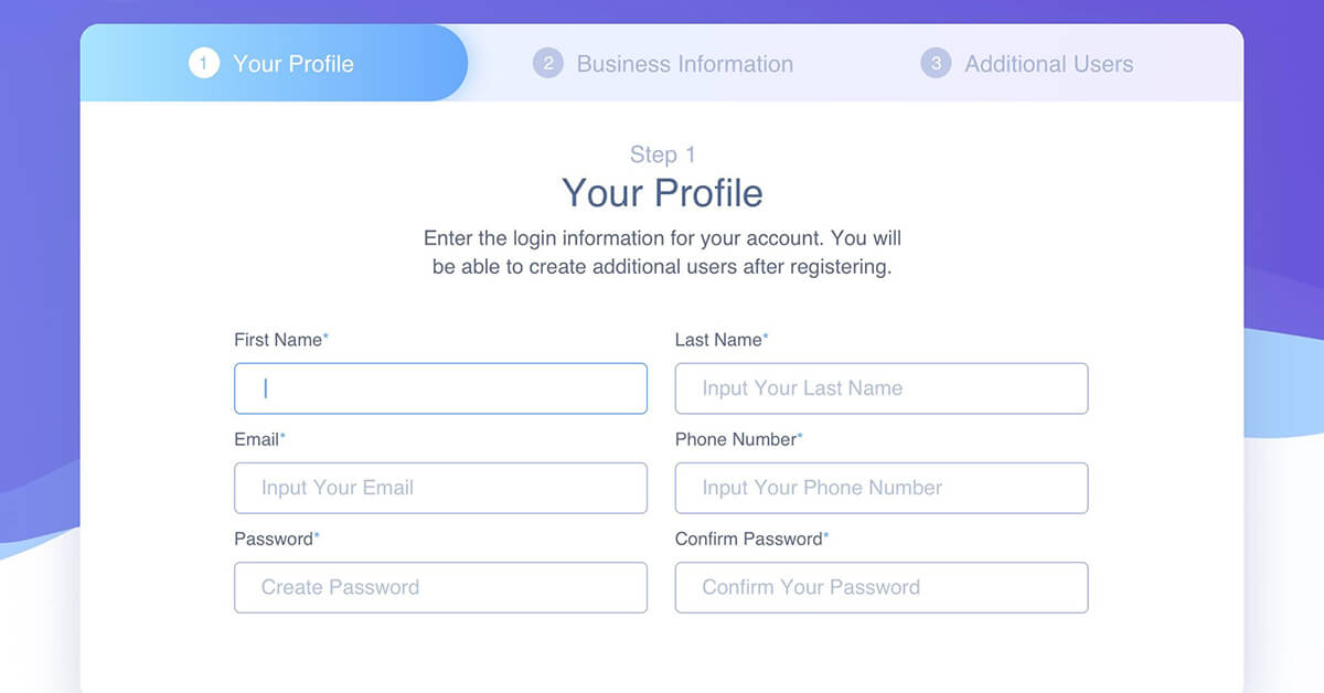
Each field must state the information that needs to be filled in and the desired format for each field. For example, if the format is month/day/year, immediately make this clear when entering a date of birth.
To reduce cognitive load, you can break long forms into bite-sized chunks. Chunking groups of related information or content together makes them easier to understand.
Asking yourself, “How would this look if I used a printer?” when assessing a form is an excellent way to improve it. The fields should be easy to read and fill in. A poorly laid-out form will be obvious when viewed in print because the fields won’t line up correctly, and there will be confusion over which information needs to be filled out and where.
9. Media Control
Mobile video consumption is growing at an annual rate of up to 100%. It’s been estimated that viewers retain 95 percent of a message in a visual format, compared to the 10 percent they retain from the written word. But this doesn’t mean that your video content is automatically accessible. It may be the opposite.

WCAG guidelines state any autoplay function on media must have a corresponding option of stopping the media, playing back, or muting it. Without this, users may suffer exposure to traumatizing content without warning, blinking lights that may trigger seizures, or deal with distractions that make browsing a page impossible.
It’s essential to avoid endless autoplay and combine video and audio that creates an overwhelming distraction. Including media, control gives users autonomy over what they view and how they view it.
Do You Know Your Website’s Hidden Growth Potential?
Take our conversion-driven web design test and see how much of your website is designed for growth and which parts make people leave your site forever.
10. Video Captions
Over the past decade, using captions and subtitles for videos has become increasingly common. Content creators now realize they need to include them if they want their content to be seen by as many people as possible.
Captioning is required for deaf people to access video content and those who struggle to understand audio content. Using speech recognition software can help set up captions and subtitles for videos and make them more accessible.
It would help if you also considered that many people might not understand the content of your videos. To mitigate this, provide audio descriptions of any videos you publish. Include the information being presented, why who or what the video was made for, and how to contact the person making the video. It immediately tells the viewer why the video is essential and how they can get more information. It adds value to their experience and keeps them engaged and interested.
Checking Your Website For Accessibility Made Easy
You can use this guide to check a website for accessibility, ticking off each element. After you’ve finished, you’ll be able to create a site accessible to even more people than ever before.
Accessibility is about making sure that your site works for as many people as possible, regardless of their browser or device.
We’re here to help you build a successful business online peacefully. By providing you with the tools, systems, templates, support, and training needed to automate, succeed and scale without complexity, chaos, or stress. Contact us at Appledew today.